The Seven Basic Tools of Quality

The ability to quickly and efficiently identify and resolve quality-related issues is essential to anyone involved in quality assurance or process improvement. With the seven basic tools of quality in your arsenal, you can easily manage your product or process’s quality or method, regardless of which industry you are serving. These tools are - Flow Chart, Histogram, Cause-and-Effect Diagram, Check Sheet, Scatter Diagram, Control Charts, and Pareto Charts.
These seven basic tools of quality are the gold standard for troubleshooting a range of quality problems, including quality control methods. They are also applied in combination with the most commonly used methodologies of today’s performance development, including different stages of Six Sigma, TQM, continuous process enhancement, and Lean management. The seven basic quality methods are visualization strategies used to define and address product or process quality-related problems.
The seven basic tools of quality are standardized and fundamental tools that enable companies to develop their method of managing and manufacturing to achieve enhanced consistency of the product. The elementary benefits of these quality tools -
- Provides a more systematic route to troubleshoot and increase efficiency
- Simple to comprehend, and yet incredibly successful in executing
- A theoretical and analytical problem-solving method
- Follows the law of 80/20, i.e., benefit 80 percent with 20 percent commitment
- Increase product and service efficiencyd
- Helps in the detection and review of process issues
1. Stratification (Divide and Conquer Diagram)

Stratification is a quality assurance check method that divides data into sub-categories and classifies data based on category, division, class, or level. It helps to explain an emerging problem by deriving meaningful information.
Stratification analysis is a technique used to arrange individual and distinct classes of documents, objects, and individuals. Using stratification, separating the data will help you assess its value, exposing correlations that would not usually be apparent when lumped together.
If you are looking at facilities, items, movements, resources, or even weekdays, a stratification review helps you make sense of the data before and after it.
2. Histogram
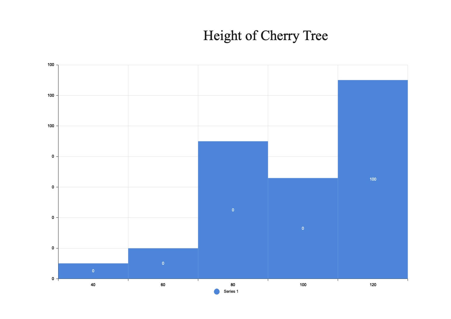
Quality assurance professionals are concerned with evaluating and assessing multiple data types’ actions to control consistency. This is where quality management devices such as the histogram come into play.
The histogram will help you accurately and concisely reflect the frequency distribution of data within various classes of a study, allowing you to recognize areas of improvement within your processes quickly and easily. In a bar graph-like structure, each bar within a histogram represents a group, while the bar height represents the data frequency within that group.
3. Cause-and-Effect Diagram
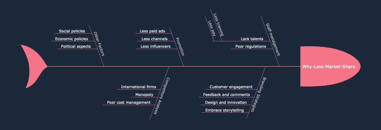
This quality control method is also known as the fishbone diagram, named for its similarity to a fishbone. This method functions by identifying a quality-related concern on the right side of the diagram, with individual root causes and sub cause branching off to the left.
The causes and sub-causes of a fishbone diagram are generally divided into six major categories, including dimensions, components, people, climate, processes, and devices. These groups will help you define the likely cause of your dilemma while preserving a coherent and ordered diagram.
4. Check Sheet
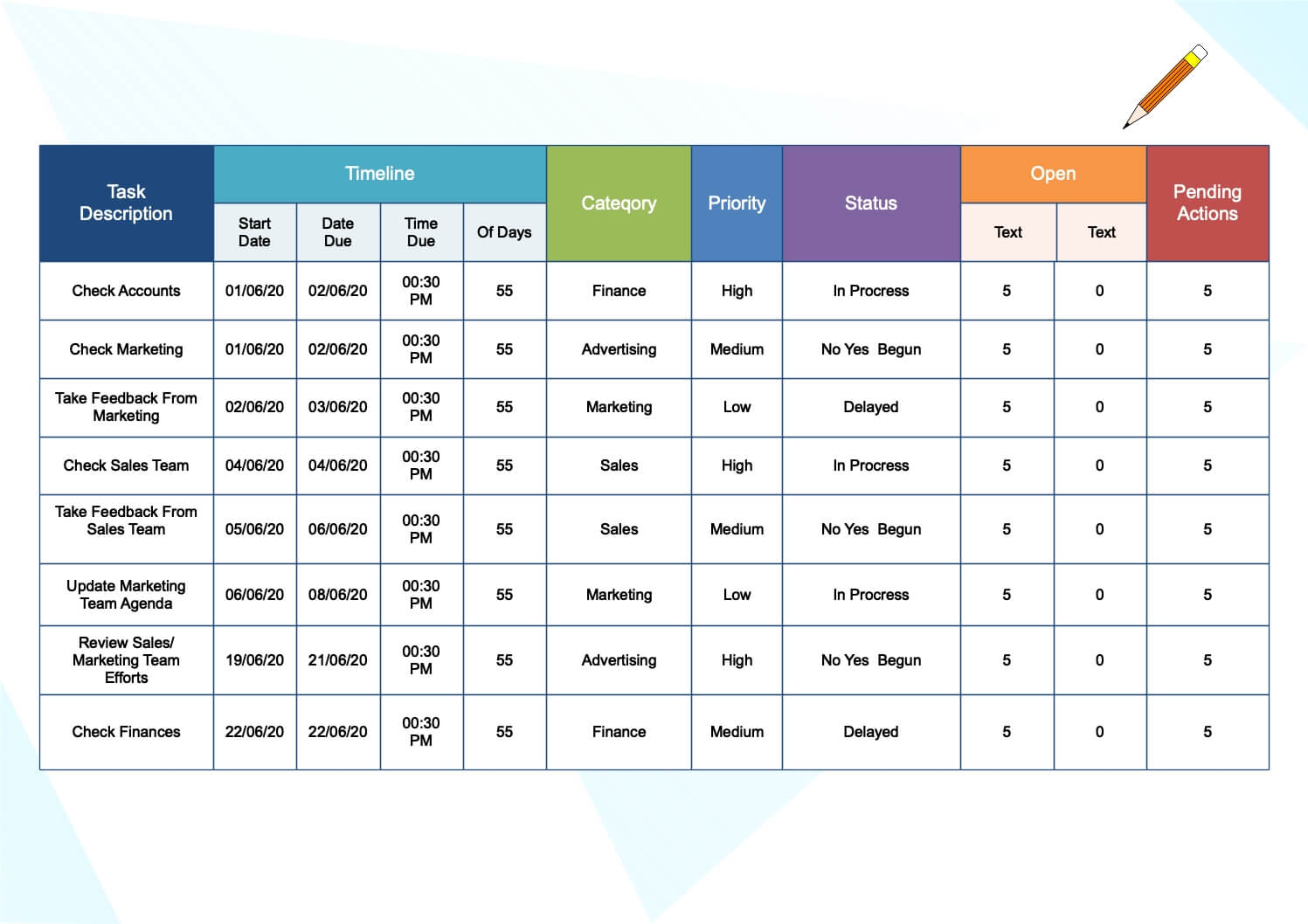
Always use check sheets to capture quantitative or qualitative data. They can also be called a tally sheet, and they serve the purpose of gathering quantitative data. A check sheet collects data in the form of check marks or checklist marks showing how many times a given feature has happened, helping you to easily key in on faults or failures within the procedure or product, trends of responsibilities, and even cause defects.
Check sheets make it easy to record preliminary frequency distribution data when calculating operations, due to its quick setup and easy-to-read graphs.
5. Scatter Diagram
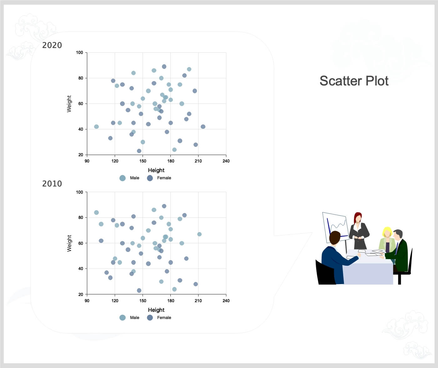
Of the seven quality tools, the scatter diagram is the most helpful to represent the interaction between two factors. It is a suitable tool for quality assurance experts looking to define associations between cause and effect.
With dependent Y-axis values on the diagram and independent X-axis values, each dot represents a typical point of intersection. These dots will illustrate the relation between the two variables when joined. The stronger the diagram association is, the greater the link between variables.
Scatter diagrams may be useful as a quality management mechanism when used to describe associations between quality deficiencies and potential environmental operation triggers.
6. Control Charts
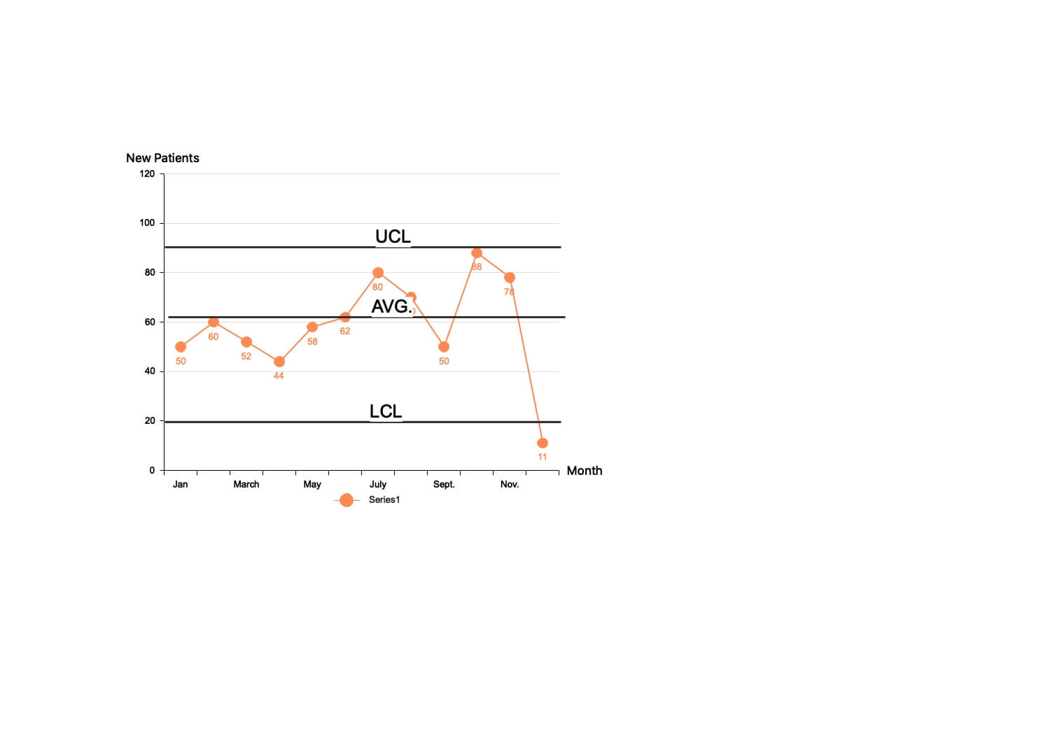
This quality enhancement method will help quality assurance practitioners decide whether a procedure is reliable and consistent or not, making it easier for you to detect variables that may result in deviations or defects.
Control charts use a centerline to represent an average or norm and an upper and lower line to show upper and lower regulation limits based on historical statistics. By comparing historical data to data obtained from your current process, you can decide whether unique differences influence your current process.
Using a monitoring chart will save time and resources in your company by forecasting success in the process.
7. Pareto Charts
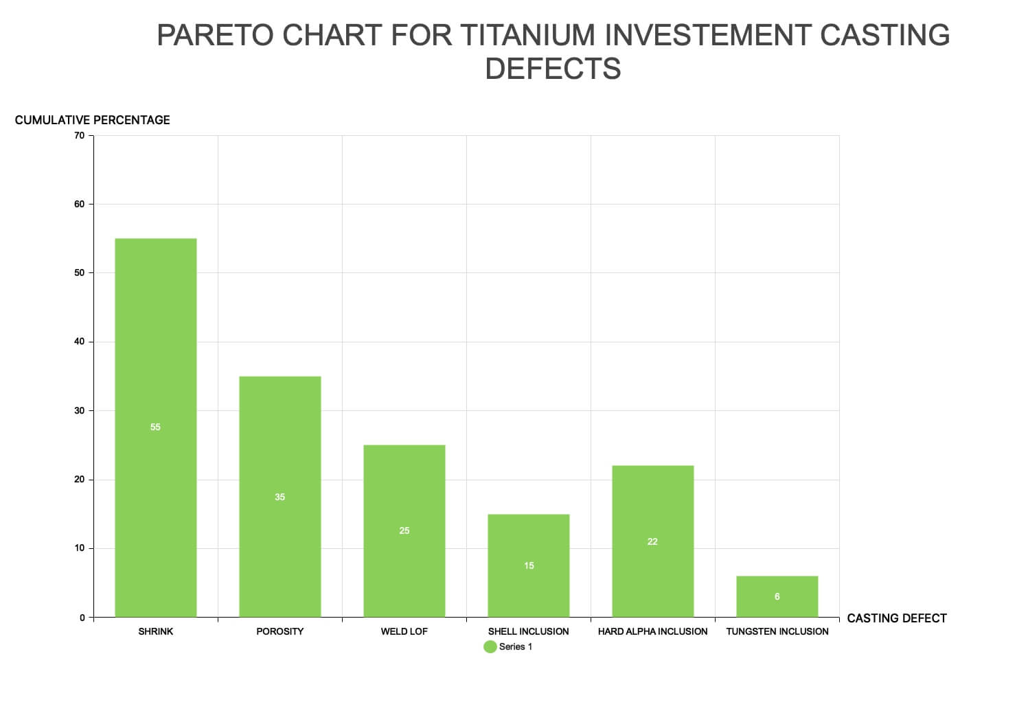
The Pareto chart serves as a quality management mechanism according to the 80-20 law. This theory suggests that 80 percent of the problems in a process or procedure are caused by 20 percent of major factors in each process. Eighty percent of small factors are driving the remaining 20 percent of the problems.
The Pareto chart, a hybrid of a bar and line graph, represents individual values in decreasing order using bars while the rows represent the combined sum. The Pareto chart aims to illustrate the relative importance of several criteria, helping you define and concentrate your attention on the variables with the most significant effect on a particular part of a process or structure.
The seven basic tools of quality are relevant in any industry. They help in ensuring quality throughout various business processes.
MindMaster's practical diagramming software offers all the resources you need to complete each stage of process management and quality assurance, from recognizing potential triggers of different defects to incorporating time and money-saving solutions. You can create detailed and visually appealing mind maps with only a few clicks.